Vevo Android
When I started at Vevo, one of my first projects was the Android app. During this time, I worked on three design variations: a 2.0 version with the feed feature, a Material redesign, and the 2016 simplified version.
Working closely with the Android development team, creative director, and product managers, I worked on feature planning, prototyping with InVision, visual and UX design, as well as production design with tools like Zeplin and Sketch.
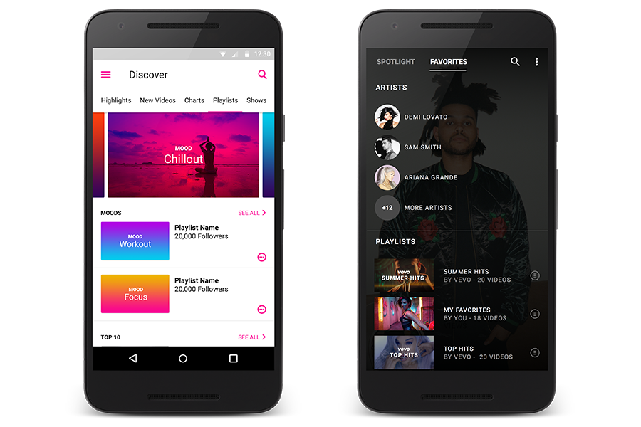
Below is the Lollipop Material OS design released July 2015 on the left and a simplified rebrand from the beginning of 2016.
Lollipop was step one in the simplification and aligning our brand with Material Design. We wanted to refocus the UX around Discovery and took the first step towards app personalization. Our KPIs were to increase streams per session and retention.
The rebrand, on the right, took navigation a leap further.
We updated the navigation and card design over time, each time getting more and more simplified. With the rebranding we wanted the homepage to be completely personalized. We worked with our content and data teams to come up with a solution.
Lollipop Feed Concepts
When first redesigning the feed, I broke down each post type and the style to be distinct during user interaction. I wanted users to be able to jump to the content they loved quickly.
Based on user feedback we simplified the post types to what mattered the most to the users.
Artists and videos we know they already love
Recommendations based on their frequented artists
Top videos and genre charts for exploration.
Playlist Designs
In the Lollipop Material design, we broke out the playlists based on curated content.
With the rebrand, the playlist design became more personalized. After testing, we found users only wanted to see their custom playlists and have the ability to favorite curated playlists.
Search Designs
During the design process, the team restructured search results based on user feedback. First, we found our users wanted to see more official videos, not lyric or interview content. Our users prefered not to see recommendations when searching.
Artist Detail Designs
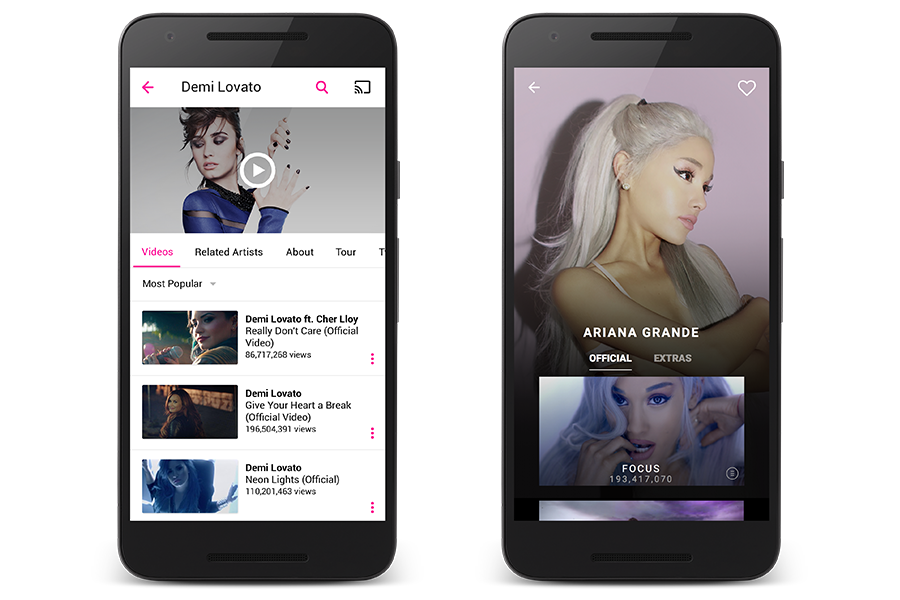
With the redesign of the artist details, as with search, our users like to see official videos front and center. We tested adding videos into categories but found a simple “Extras” option was sufficient for other content types. We also added large, engaging artists images.
Player Designs
Vevo’s player has remained steady throughout product iterations. However, added the ability for our users to “Favorite” the videos, artists, and playlists they love. Vevo also tracks users watch history and allows them to go back for to rewatch based on this history.
BONUS: The team received Editors’ Choice in September of 2015 and a nomination for “Best Use of Material Design" in May of 2016. Download App for Android


