Vevo TV & XBOX One UI
Vevo TV
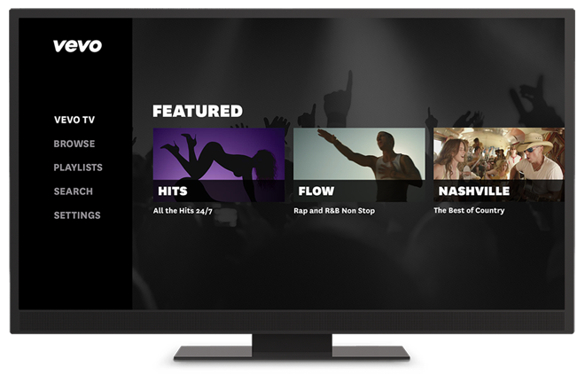
Vevo TV UI was designed with 10-ft in mind and supports Vevo’s massive music video catalog. Working with the director of design, we kept the interaction and navigation as simple as possible.
Based on project specs provided by the product manager, I wireframed the information architecture and user flows. I explored visual options and user edge cases.
The following design was created to function across multiple platforms like PS4, PS3, Samsung TV and Opera TV browsers.
tv.vevo.com launched in the Fall of 2014 and again with a rebrand in the Winter of 2015.
After launching the app, the user lands on Vevo TV
Browse
From the navigation, the user can browse Vevo’s catalog by genres. Within each genre, users can view featured content, top videos and artists, premieres, and live content.
Search
When navigating to the search screen, the content section show is the most popular items in the catalog. The content sections repopulate as the user types in their new search.
User Playlist Detail
The user can sign in with their Vevo account to access existing playlists, add to and create new playlists.
Artist Detail
Artist detail screen can be accessed through search or browse screens. These pages house all of the selected artists videos and related artists.
Genre Icons
For this project, I designed custom iconography that fit the Vevo brand for the genre categories.
vevo xBOX one
Working with Microsoft, product managers, and a lone engineer, we developed Vevo for XBOX One. Using Microsoft’s UI templates, I designed the information architecture to fit Vevo’s content. The design process took one month.
Watch Vevo TV
Vevo TV
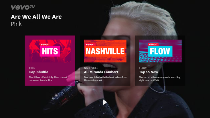
One of the most popular features of Vevo's TV apps was VevoTV. Users would turn on the channels during parties, working out or while they were getting ready for work.
Featured Content
Featured
After interviewing users of the TV apps, we found that most people just wanted the top content front and centered. We focused on most viewed and featured content.
Watch
Player
Following the player UI guide, we tested both top and artist content in the video playlists. Top videos always win.
User Playlists
Playlists
With the app we allowed users to log in, view existing and create new playlists. We also surfaced recommended playlists based off of the videos they were watching.


