Strava Local Routes
Goals
Increase the amount of city route web pages
Strengthen the organic visitors to Strava Local, acquiring users through SEO
Milestones
Redesigning the local routes page to house 10,000 cities instead of the current 76
Create an easy way to index these pages with SEO
Improve features of the City Guide and map view for improved content discovery
Create a single route page design to combine the logged-in and logged-out experiences
Create a sponsored city guide design for potential partners
Result
In a few short months, the Strava Local Guide traffic increased 4x
Milestone: Local Landing Page (Index)
Business Problem: Strava needed a way to surface the vast quantities of city guides and their related activities for search engines to crawl.
Athlete Problem: Find routes for the desired city and their corresponding sport.
Starting out, we researched what other companies are doing for content related indexing. Companies like Airbnb, create a hidden list of content where Amazon, for example, creates a visual organized list.
Solving for both athlete and business needs: Above the fold, focus on athlete needs with route branding, search, and popular city guides in the area. Below the fold is listing of top routes by continent > country > region/state > city
Wireframe - above the fold - solving for athlete need
Wireframe - below the fold - solving for business need
The next step for this project is working with the brand design team to brand the Strava Route Guides for the long term vision.
Concept Route Index - city search and draggable map
Concept Route Index - below the fold
Milestone: City Guide
The goal of the city guide page is to surface all routes in an area. We want to give both current and new users the ability to filter by distance, elevation, and activity type. We want to also increase traffic on other city guide's views, give the user to drag the map or search the guide page.
City Guide View
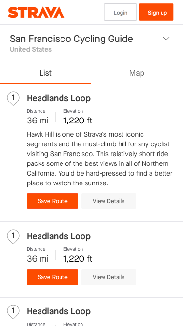
We also wanted to optimize the mobile web design of the page for new users coming in from links, like Facebook and Google.
We added the ability to toggle between views and an updated draggable map.
Mobile City Guide
Promoting More Guides
Map View
Milestone: Single Route Page
Part of the Local project is combining the two versions of the route pages, Strava Routes and Local, both logged in and out versions of routes on the web.
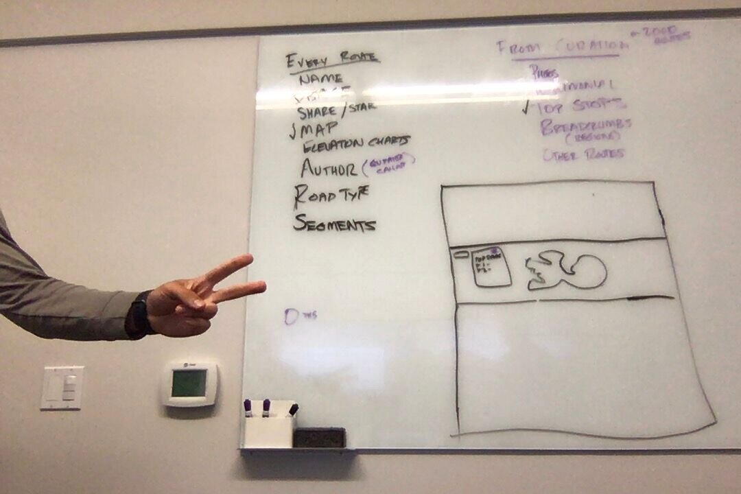
Starting off, we audited the content to get a better understanding of the existing information architecture.
Two versions of Route detail pages
Core page content
Working with usertesting.com, I showed users the existing version of the site to help up understand what features they found helpful and what was missing. From this, I learned that the detail pages are successful in giving the user the information they need to go out to run or ride the route, they even requested potential features.
With this knowledge of user needs and information architecture, we noted the critical needs and differences, and I begin wireframing potential design solutions.
After reviewing the wireframes with key stakeholders, I began to design iterations for the final solution. I received great feedback for the long term business needs from stakeholders and users on usability.
The final designs accounted for many use cases and responsive web design.
Curated Content
Limited Route Details
Milestone: Sponsored Routes
We wanted to make sure the routes we are building are perfect for the city they are apart of. Partnering companies with Great Runs create a city-specific, more curated experience for users. The routes are created by other athletes that run or ride the roads or trails daily.
City Guide
Route Detail


