Strava Routes Research
Over 2 months, as part of roadmap planning, the growth team researched the value of Routes.
Are existing Routes features something Strava should invest in for the future? Spoiler Alert: YES!
Role: Facilitator, interviewer, designer
Team: Director of User Research, contract researcher, product managers, and design partner on the Growth team.
Sample of Research Goals
What is the user's definition of "routes"?
What moments or events spark searching for or creating a route?
How are users currently creating routes for their activities?
How can Strava create quality, safe, and trusted directions for our everyday athletes?
Define user needs around interacting with routes on and off the Strava application
Process
Historical Discovery
Intercept User Testing
Competitive Analysis
Define Themes and User Scenarios
Brainstorm and Wireframe
Preform User Interviews
Iterate on Concepts
Validate
Define Next Steps
Historical Discovery
When starting this project, I wanted to learn everything about Routes. I looked at the current usage of the route features, interviewed stakeholders, reviewed past research, and ran interaction testing on the existing route feature.
Data Questions:
What is the current count of cycling routes?
What is the current count of running routes?
How many unique route creators does Strava have currently?
What is the total number of routes in storage?
What is the total number of activities that have used a route?
Intercept User Testing
On a Sunday and Thursday morning, a Product Manager and I ran intercept testing. We visited two popular spots that are frequented with runners and cyclists in San Francisco. We wanted to understand, in-person, how they use routes.
Competitive Analysis
After running intercept and user testing with the existing product, we took a look at what our competitors are doing. We determined where the needs exist and where there was market saturation.
Products
Trail Forks
Map My Run
All Trails
Komoot
Objectives:
Audit of existing products
What works well
What doesn’t work well
Ideas
Define
Myself, another designer, and two product managers on the growth team iterated on scenarios, themes, and defined assumptions about critical features.
Starting out, we broke down the moments a user chooses to create, search, or find a route.
Themes:
Recommendations
Social
Planning
Challenges
Scenarios:
Everyday Workout
Adventure Workout
Weekend Workout
Work Travel
Athletic Travel
Tourist Travel
Brainstorm and Wireframe
The team brainstormed features that would fill the users' needs for each scenario. We started by putting sticky notes on a whiteboard, then we picked out favorites we'd like to wireframe for feedback.
We took the top four wireframes and created high-fidelity designs to show users during the interview sessions. My design partner and I then split the plans up, and I created the following concepts.
Concept Breakdown
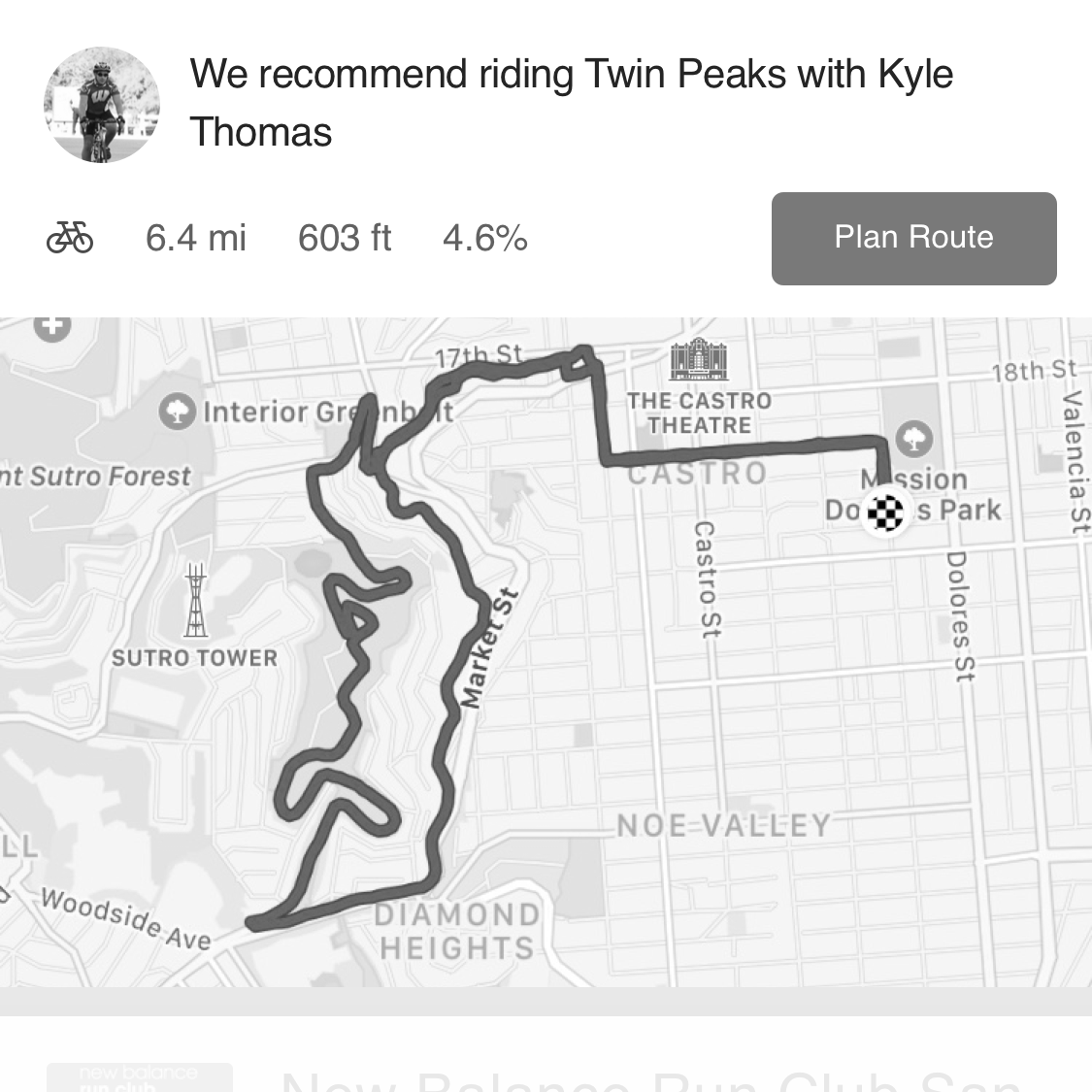
Routes from Here - three disparate routes generated from their chosen location.
Maps for Runners - places, local routes, and training suggestions for runners based on their interests and locale.
Subscriber Buddy - an assistant that suggests personalized routes based on the inputted parameters.
Goals - workout and route suggestions based on one or more specific goals.
Routes generator concept
Ride with friends concepts
Preform User Interviews
Working with the contract user researcher, we learned more about how users are interacting with routes daily. We started the interview at high-level learning about the user’s day-to-day and travel with routes. We then showed them the four concepts and asked for feedback.
“If you are doing the same workouts over and over again, it doesn’t really improve how you are or what you do.
”
All of the sticky notes!
Iterate on Concepts
With the incredibly valuable feedback, paired with the other designer, we iterated on more design variations.
Validate
With the final designs in hand, we repeated user interviews with a smaller set of users. This helped set the concept validation and looked further into how the concepts could grow for future iterations.
Define Next Steps
With all of this useful knowledge, the growth team set key opportunities to present to the rest of the Strava organization for approval.
Next step examples:
Find routes near me and anywhere
Build trust with Route details
Discoverability of Routes
Conversion experience on the web through routes


