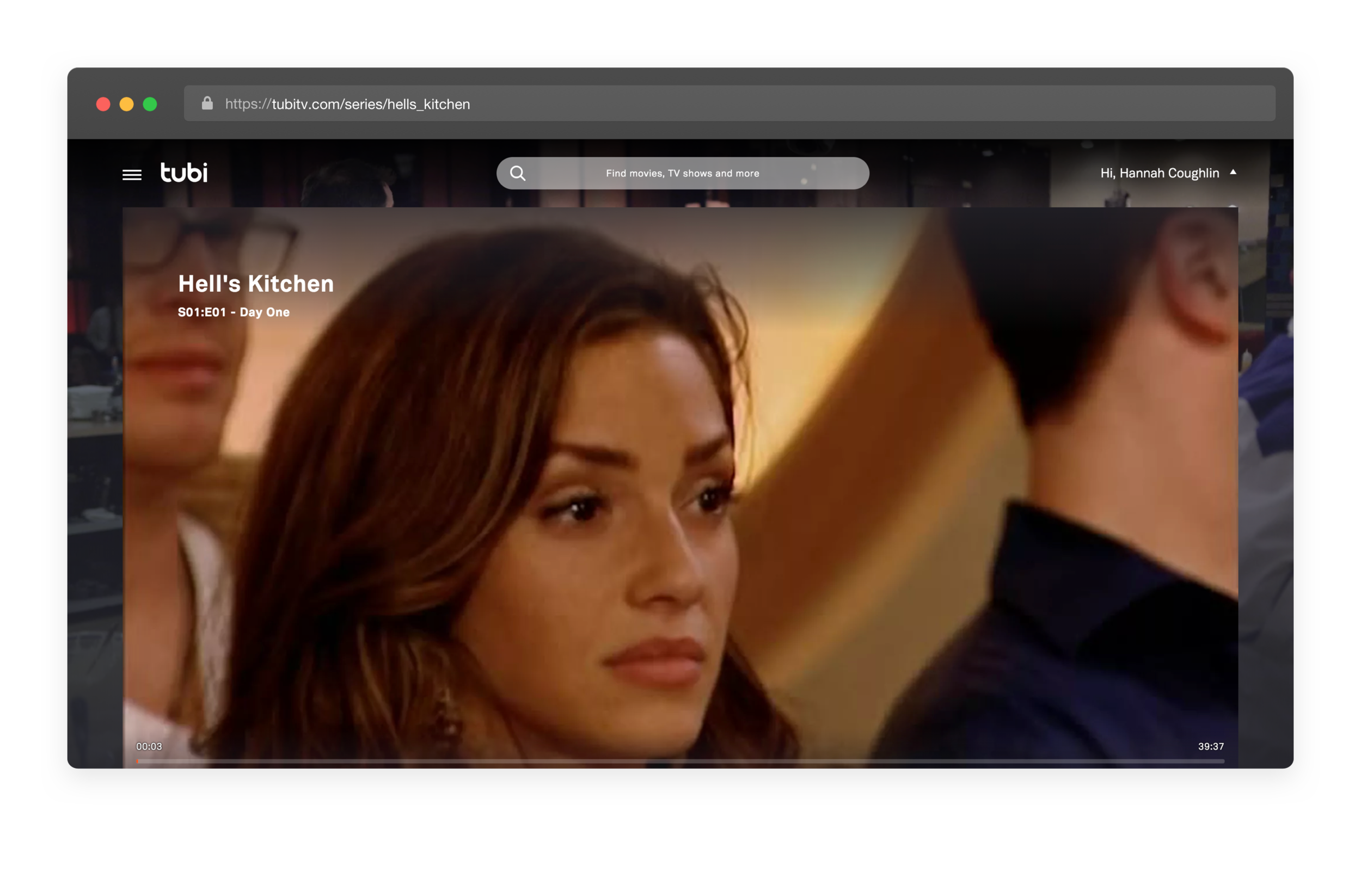
Tubi Web Title Details
Overview: Increase viewer conversion rate by redesigning the title details landing page for movies, series, and episodes.
Role: Lead Product Designer
Team: Product Manager, and two Web Engineers
Design Goals
Primary Goal: 95% of users from search engines land on a title details page but do not start playing the title. How can we better encourage users to start watching a video and increase the title start metric?
We hypothesize that removing traction on the title detail page will increase viewer conversion rate > 5-10%.
Secondary Goals:
Increase view time > 3%
Encourage users to watch more titles in the long-term, increase rolling week one viewer retention by > 1.5%
Create optimized player controls and autoplay design for increased engagement.
Create a consistent design between movies and shows.
Optimize the design for most common browser size, 1350x660.
Design with limited engineering resources in mind. What small changes can result in the highest conversion?
May 2019 Player
Original Design
Solution #1: Above the fold
Will moving title details above the fold to increase conversion? What is the minimum vs. the maximum amount of metadata that must be displayed above the fold to increase view time?
Responsive Solutions
Solution #2: Episode Metadata
Will showing additional metadata around a series increase view time?
The goals was to increase the amount of episodes and seasons viewed. The current solution hides the season count and the total number of episodes of a title.
Solution #3: Call-to-Action Focus
Will increasing the focus on CTA buttons and actions improve click through rate and increase start time? We remodeled the options for play, add to queue, and share. Seen above in the “May 2019 Player” screenshot, the call-to-action buttons are no where to be seen.
Movie Details - Mature Content Use Case
Solution #4: Related Content
Redesign the related content so it is more prominent on the page and peaking just above the browser fold. A sub-goal of this project was to determine if a user doesn’t hit play would they select or browse other content on the page?
Solution #5: Legibility
Create a balanced text sizing, increase the size of the title details text to be more legible and accessible to all users.
Movie Details - Watch on TV Concept
Solution #6: Player
Redesign the current player solution as a full-browser design. Will this increase the duration of the users watch time?
Player Design Update
Project Process
Design Iterations
Kick off with PM and engineering
Create variable visual designs for proposed ideas
Review designs with PM and lead engineer
Iterate and repeat
Finalize design
Documentation
Final review
Implement with engineering
Design and interaction QA
Roll out
A/B test CTA options and other elements.
Measure results
Iterate and repeat
Ongoing Project
The initial development, or MVP, was intended to utilize the existing elements of the site. The design was simplified for the limited development resources. Initial development was to shift the primary information (title, description, etc.) above the fold and improve the CTAs. We A/B tested of the current details page vs. new design.
Next Steps
A/B Testing
Placement of the metadata container.
Size of Watch Now CTA button.
Number of episodes shown on series page.
Size of description text.
Concept Testing with Usertesting.com
New metadata types
Visual variations
Recommended content variabilities


